What is Digital Art?

Digital art is an image that is created using a digital device like a computer, phone, or tablet. All the other media in this blog series are a process of “traditional” art, which is a catch-all phrase that works in contrast to digital art. When traditional art is scanned or photographed, that art is being digitized, but it was not created digitally.
Popular digital art programs include Adobe Photoshop, Clip Studio Paint, and Procreate, but there are many others—even classic Microsoft Paint! (That’s how I made the masterpiece on the right.) Digital artists might use their finger on a touch screen, a computer mouse, or a stylus. There are specialized drawing tablets that track stylus motion to appear in a digital drawing application.
In the last few years, you have probably seen “AI art,” or images that have been generated by artificial intelligence. These images are digital, but they are not intentionally, directly created by a human illustrator. Discussing AI is beyond the scope of this blog post. The following sections will only pertain to art that is made by real people, using digital drawing tools—not AI image generators.
Visual Characteristics
Digital art is not constrained by the physical properties of pigment, so there is no singular “look” as with traditional media. Furthermore, natural paper textures can be scanned, brush strokes can be emulated, and colors can be picked from traditional sources, so digital art can often look like traditional art at first glance. However, once you know what to look for, digital art is identifiable. It’s a bit tricky, so I have broken it up into sections.
Layers and Edges
Most digital art programs have a “layer” function. Just like in real life, you can build up layers of colors and marks. Unlike real life, each layer appears in a menu, which can be manipulated, reordered, or discarded at will. Below is the basic layer menu on the design website Canva. Look at the stack of layers on the left, and see how the layer order affects what is in front and what is behind.
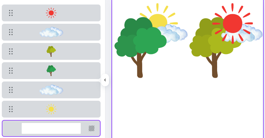
How do we recognize digital layering? You can look closely at the edges of shapes that are part of the illustration. Traditional media tends to behave differently where one field of color meets another: Paint might be applied a bit thicker on an edge, cut paper leaves a visible shadow, and pigment can set unevenly. Digitally, you can layer as many elements as you want, and the computer automatically displays them front to back. Digital layering can be recognized by clean, flat, overlapping elements.
Digital layering also allows light elements to easily go on top of dark elements without the opacity issues and width considerations that some traditional media have. If you see thin or small light-colored marks over a dark background, that could be a sign of digital art.

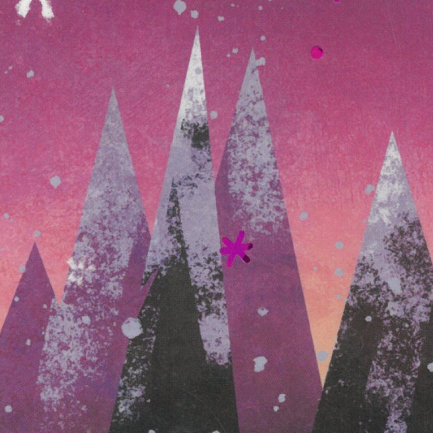
Consider the cover of Snow Falls by Kate Gardner, illustrated by Brandon James Scott. We have some nice texturing in this image, which adds a natural feel. The digital “tell” is in those pointy mountains. They have razor-sharp edges and perfect points. If the mountains were, say, cut out of paper, we would be able to see the slightest shadow of the paper’s depth along the edge of each piece. If the mountains were paint, applied with some kind of masking tape or straightedge, we would be able to see brushstrokes or slight imperfections where the tape peeled weird or the paint went on thick. This level of precision is made possible by a computer!
Line weight
If you see a wide range of line weight in an image, it may be digital art. Digital lines can be a single pixel wide, up to several hundred—the range of line sizes is much broader than traditional media. Digital artists can zoom in and work a lot of detail into a tiny portion of their picture. Additionally, digital elements can easily be resized. If they’re scaled up, the lines will become proportionally thicker, and if they’re shrunk down, the lines will get very thin.

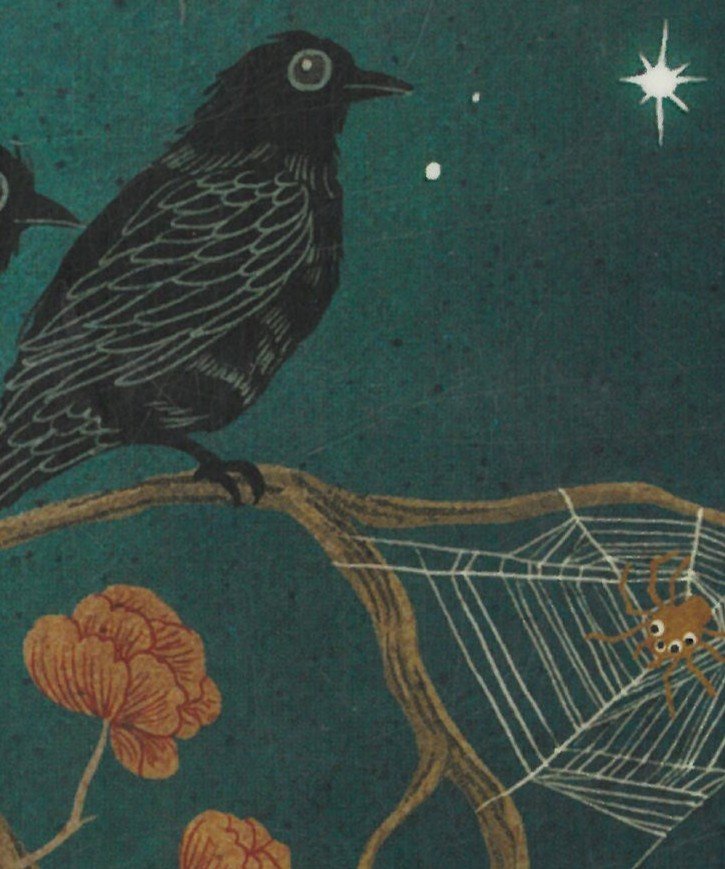

Look at the cover of Beatrice Likes the Dark, written by April Genevieve Tucholke and illustrated by Khoa Le. This lovely cover has lots of very thin lines (and light-on-dark layering). Try to imagine a pen tip or paintbrush that could easily produce the thin, precise lines of the feathers, flowers, and spiderweb. Digital tools make this style possible!
On the other end of the line wight spectrum is Stanley’s School by William Bee. Notice that those thick black outlines have a perfectly consistent width. Look at the wheels. See how they are perfectly round and perfectly centered? The line endings can also be a clue. Some art programs round them off, or make them square. Many artists like to use digital brushes that taper off for a more natural look, so this usually won’t be so apparent. Finally, look at Stanley’s yellow tassel, a pure light color easily sitting atop pure black—more light-on-dark layering!
Colors
Digital color pickers often have a hue slider and a light-to dark axis of some kind. Look at the the color picker(s) from Canva, below. Every pixel of that rectangle is a potential color option. If you are familiar with the colors available from traditional media, you can ask yourself if a color looks like it came from a physical substance, or from the far reaches of a digital color picker. One way to identify digital art is to look for bright, almost neon colors, especially cyan and magenta. These hues are rare in traditional media.
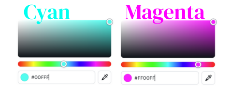

Digital art has opened up some amazing possibilities in terms of color layering and shading. Putting light colors on top of dark areas is easy. Additionally, it is easy to adjust the opacity, letting the artist layer semi-transparent swaths of color. This allows for lush, beautiful lighting that practically glows, as well as subtle shading and smooth color gradients.
Bunheads, by Misty Copeland and illustrated by Setor Fiadzigbey, is a great example of this. It has a limited palette: just tan and pink, but there are many different shades. Notice how the background right behind the ballerina is the lightest, and then it gradually gets darker towards the edges. Where else can you see a light-to-dark gradient? (Answer: her tights, her shadow, even the text in the title!) Finally, her skin is not one solid brown, but an artful layering of many different tones. Computers are really good at incremental color transitions; digital coloring is what makes the image so rich, warm, and inviting.
One unfortunate indicator of digital art is a pervasive grayness in the color palette (I’m calling it Digital Coloring Syndrome—you heard it here first!). I am not going to include any examples out of respect for the illustrators, since it is not very complimentary. This grayness can happen for many reasons. The artist’s screen may not have the correct color calibration. Screens are backlit, and colors that look fine on a screen might look duller when they’re printed out. Remember that digital artists are not working with a set of existing pigments, they are manipulating a color map like the one above. When faced with near-infinite possibilities, an untrained eye may not know how to develop a unified set of colors to use in their work.

Copy-Pasted Elements
This is only noticeable occasionally, but it is a dead giveaway for digital art: digital tools allow multiple exact copies. In On Account of the Gum, Adam Rex uses the same rabbit in a handful of illustrations. Artists might use this strategy when they need to fill in a field of flowers or a lush forest full of leaves and shrubs. Drawing just a few, they can easily be multiplied to fill up a scene. A savvy artist like Adam Rex will rotate, resize, reverse, or randomize the pasted elements to make things look a little less identical.
Artists, be careful! Though this trick will save a lot of time, if the copy-paste is too obvious it might make an artist look lazy or unprofessional.
Let’s Practice Together
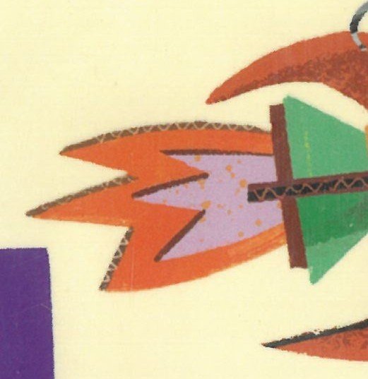
Now that we’ve learned the key visual characteristics of digital art, let’s practice with Boxitects by Kim Smith. The first thing I notice is the bright, fun colors. Next, the layers of boxes that make up the castle have clean, sharp edges. Finally, I can see very thin, light lines on a darker background in the carboard corrugation and also the girl’s ponytail. With all of these clues, it is easy to recognize the digital medium.

Compare and Contrast
Recognizing digital art takes a keen eye. An easy way to practice is to find an artist who does both, and compare them. Below, I’ll list a few artists who employ both traditional and digital media. The cover images that I have for this blog post aren’t the highest quality, so I recommend checking out physical copies from the library.
Will Hillenbrand: The Voice in the Hollow and The Golden Sandal
Peter H. Reynolds: The Dot and The Word Collector
Joe Cepeda: WPPL only has examples of his digital work, such as Lupe Lopez Reading Rock Star! However, you can borrow Watch Me online on Hoopla, which is traditionally illustrated.
David Macaulay: The Way Things Work Now is an updated edition, which features Macaulay’s original ink & watercolor illustrations. Additional material sports new, digitally colored drawings. Can you tell which are which?
David Small: Cat’s Very Good Day and So You Want to be President?


Frequent Pairings
Digital art can be used with almost anything! It is great for fixing small errors in traditional work, or assembling photos or scans in a digital collage. Many artists like to use graphite or ink to hand-draw outlines, and then color them digitally.
Read More


Pictured above:
Kiyoshi’s walk, by Mark Karlins
The truth about dragons, by Julie Leung
Goodbye spring, hello summer, by Kenard Pak
Sounds like joy, by Yesenia Moises
A bear, a fish, and a fishy wish, by Daniel Bernstrom
Ride, roll, run, time for fun! by Valerie Bolling
Home is where the heart is, by Emily Dodd
Amira’s picture day, by Reem Faruqi
Mustache baby, by Bridget Heos
Hurricane, by John Rocco
Eyes that kiss in the corners, by Joanna Ho
Lily’s dream, by Bea Jackson
Fatima’s great outdoors, by Ambreen Tariq
The man who didn’t like animals, by Deborah Underwood
Twelve days of summer, by Sherri Maret
Beekle the unimaginary friend, by Dan Santat